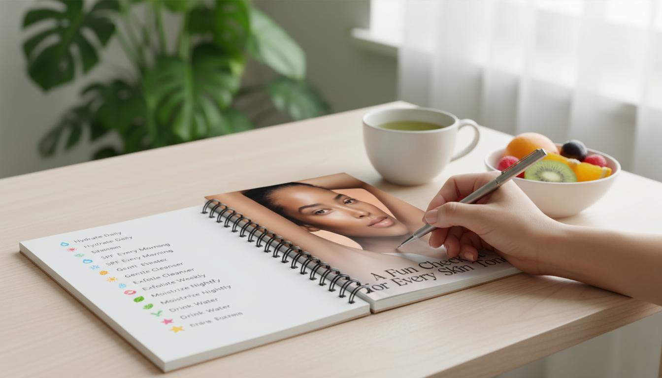
Finding a lipstick that looks effortless comes down to two things: undertone and depth. Once those are clear, it’s much easier to spot why a red looks “off”—and how to fix it fast (swap undertone, shift depth, or change finish). Use the printable as a quick reference while shopping or decluttering, especially when store lighting makes every tube look like “the one.” For more guidance, see Best Lip Color for Your Skin Tone and Color Palette 2025.
For a quick, science-backed refresher on undertones (especially if you suspect you’re neutral or olive), Cleveland Clinic’s guide is a helpful reference: Understanding skin undertones.
Think in “families” instead of exact shades. A blue-red and a tomato red can both be gorgeous reds, but they behave very differently depending on your undertone and lip pigmentation.
| Skin depth | Cool undertone reds | Neutral undertone reds | Warm undertone reds | Notes |
|---|---|---|---|---|
| Fair/Light | Blue-red, raspberry | True red, rose-red | Tomato, warm poppy | Prefer clear, bright pigments; avoid overly muddy browns |
| Light/Medium | Cherry, cranberry | Classic red, red-rose | Brick-leaning red, spiced red | Satin finishes are the easiest to wear daily |
| Medium/Tan | Cranberry, wine-red | Deep true red, warm berry | Terracotta, rust-red | If reds pull orange, shift cooler; if they pull pink, shift warmer |
| Deep | Blue-red, burgundy | Oxblood, deep true red | Mahogany, deep brick | For maximum impact, use liner + cream/satin formula |
Two people can wear the same lipstick and get totally different results because of contrast (lip pigment vs. skin depth), lighting, and how opaque the formula is. Before you declutter a shade you “should” love, try these quick fixes.
If you’re testing shades, take one photo in indirect daylight and one in indoor lighting—your phone camera reveals undertone clashes fast. For a deeper dive into how color is described (and why “red” can mean so many different things), Pantone’s overview of color systems is a useful explainer: Pantone color systems.
Try a neutral foundation test in daylight: if many shades look both “too pink” and “too yellow,” you may be neutral or olive. Another shortcut is lipstick comparison—if orange-reds turn coral on you but blue-reds look crisp, you likely lean cool; if the reverse happens, you likely lean warm. Taking a no-flash photo in natural light can also make undertone differences easier to spot.
A medium-depth true red or balanced rose-red (neutral-leaning) tends to flatter the widest range of undertones. Satin or cream finishes are especially forgiving because they don’t emphasize stark contrast the way very matte, very blue, or very orange reds can.
Your natural lip color can deepen, brighten, or cool down the shade, and lighting can exaggerate warmth or make reds look flatter. Some formulas also oxidize as they dry, and sheerer lipsticks show more of your undertone. A lip liner, a primer, or switching finishes (matte vs. satin/gloss) usually brings the color closer to what you expected.








Leave a comment